Calling All Readers: PLEASE Help...I need more perspectives!
I am OVERwhelmed with anxiety over this.
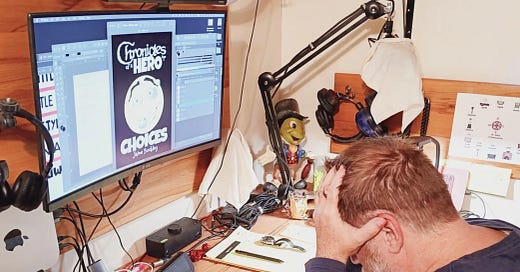
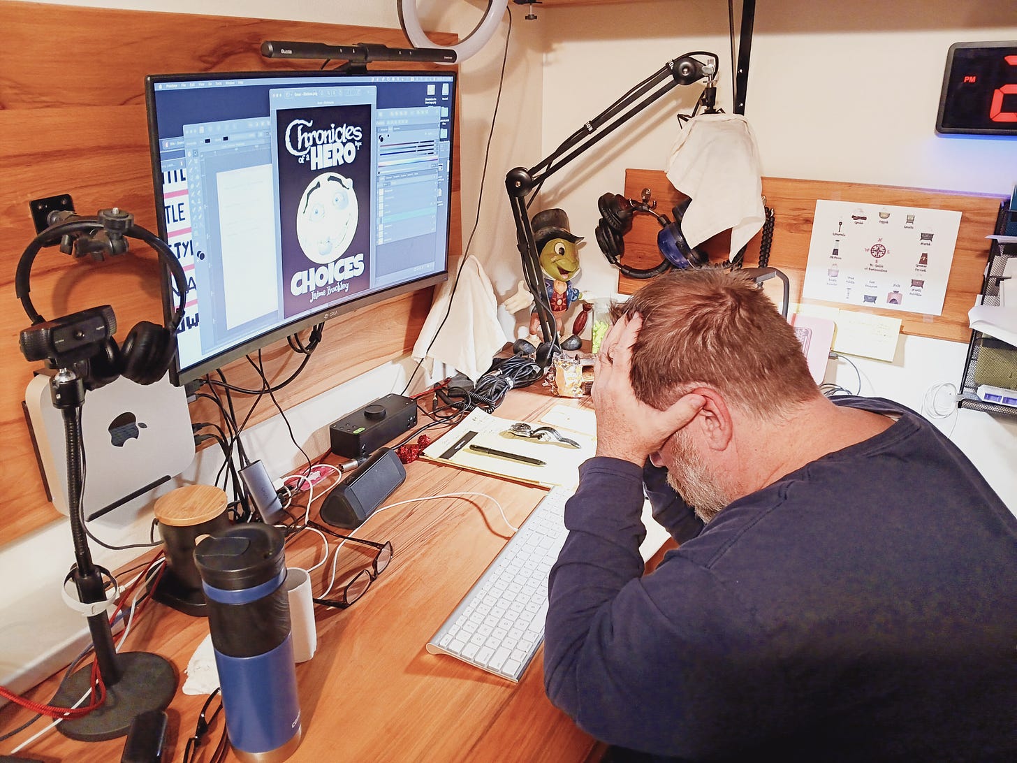
Been working night and day…(okay, mostly just day) on the cover AND IT’S NOT WORKING!
HELLLLLP!?!!!
It has been a WONDerful week. Honestly, it has. So productive,…I’ve felt better than I have in weeks, and then I hit a wall.
…with my face.
I know you get the next episode of Chronicles at 5pm today, but I hope you’ll forgive two emails in a single day.
You’re so smart and have such wonderful perspectives, I must draw upon your collective powers of creativity and opinion (yes, I’m talking about YOU, Benjamin)…
The book is done.
100% done.
$500 in ISBN’s are complete and registered, the meta is done, and I even had to tweak the font sizes, because the final product was TOO BIG for Amazon to print!
HAHAHAHA….now THAT’S a new one for me.
I have one last challenge to get to publication:
The Title Fonts Aren’t Right!
I know. We went over this.
We’ve talked about this.
…but my gut doesn’t like it.
SOMETHING DOES NOT FEEL RIGHT.
(Sorry for the caps, but that’s what my brain is doing. It’s shouting at me…. DANGER WILL ROBINSON! DANGER! DANGER!!)
When my gut doesn’t like something, BAD things happen.
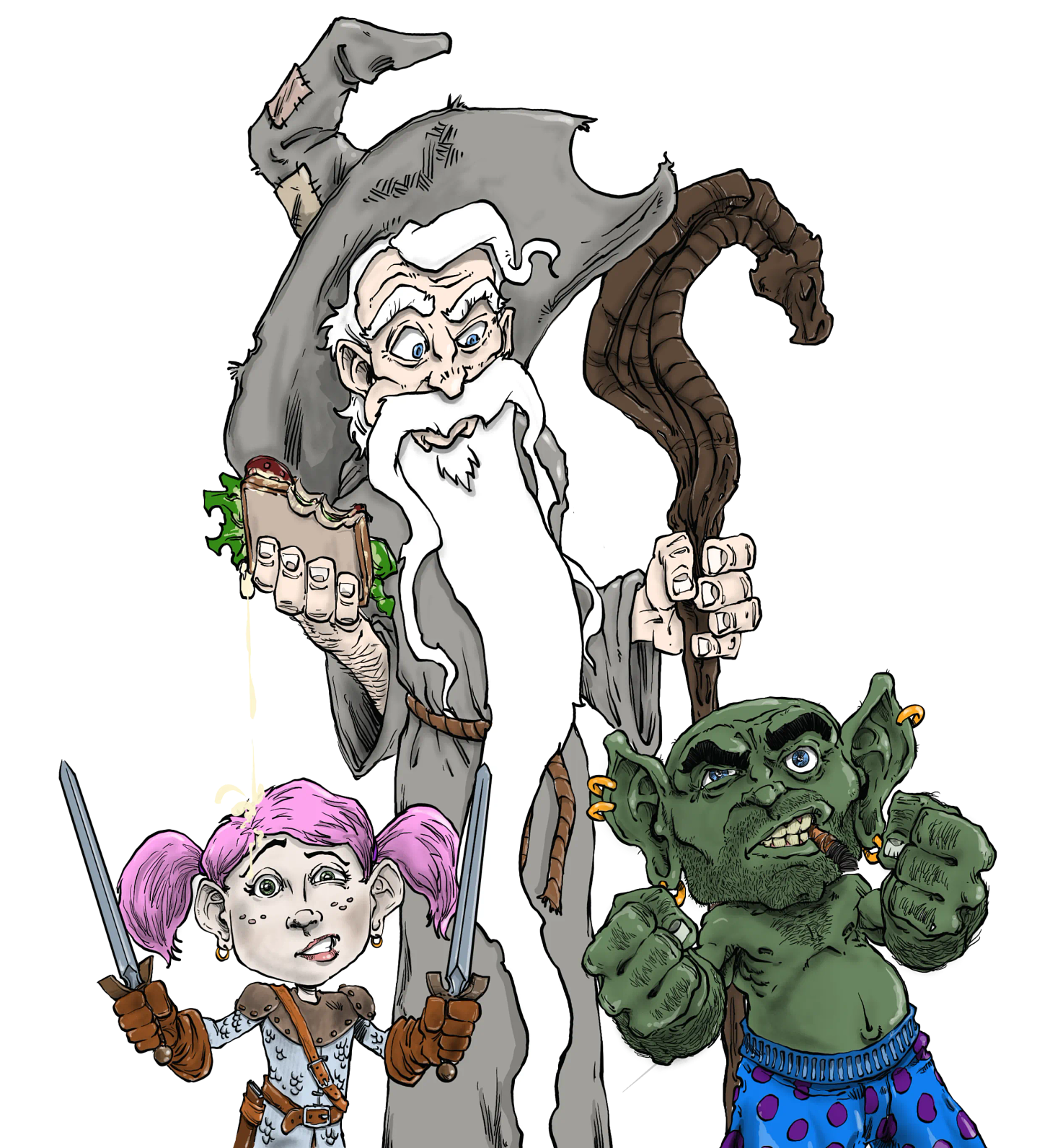
I have the characters done for the back cover…
…and that looks GOOD…but when I looked at the front of the cover, I actually cringed.
AUTHOR PRO TIP:
THIS is why you always take a few days and WALK AWAY FROM YOUR CREATIONS….so you can come back with fresh eyes.
Does ANYone see what I mean?
The smiley is FINE, but the title fonts….they look HOME MADE!!
AAAARRRRGH!
…I mean, well,…I guess they ARE home made, BUT YOU KNOW WHAT I MEAN, right!??
*inhale*
*exhale*
*inhale*
*exhale*
I’m gonna need oxygen after this.
I’m thinking I should go back to the fonts I’ve been using for more than a decade. Like the ones below…
Am I crazy?
….and I mean LESS thank usual…..
(watch it Dre…🤨)
I guess I’m wondering if anyone see’s what I see?
*sigh*
This is me, wanting the best possible book cover I can make. When you helped me with the Underling cover, the final results were epic.
I’d like to get this published before the end of next week (knock on wood), but the fonts have to change.
UPDATE! (Yes, already! wooHOO.)
There.
…and I didn’t need oxygen (grin).




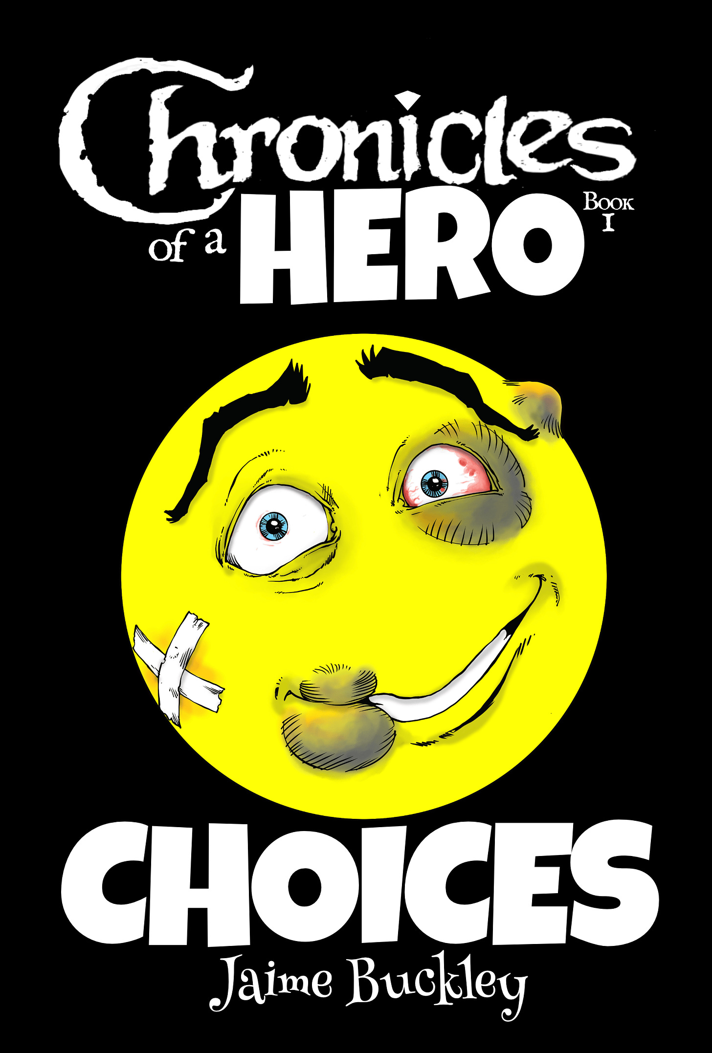
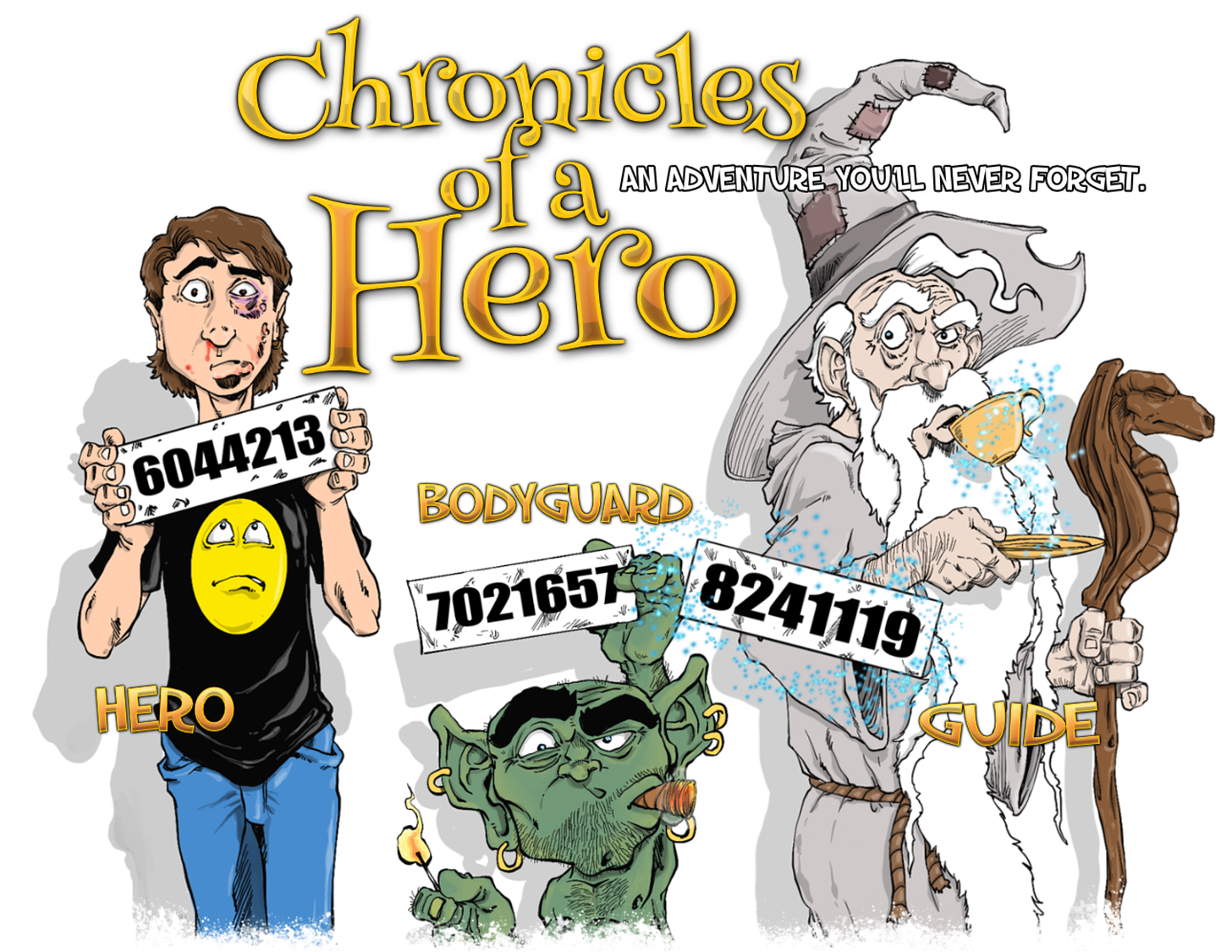
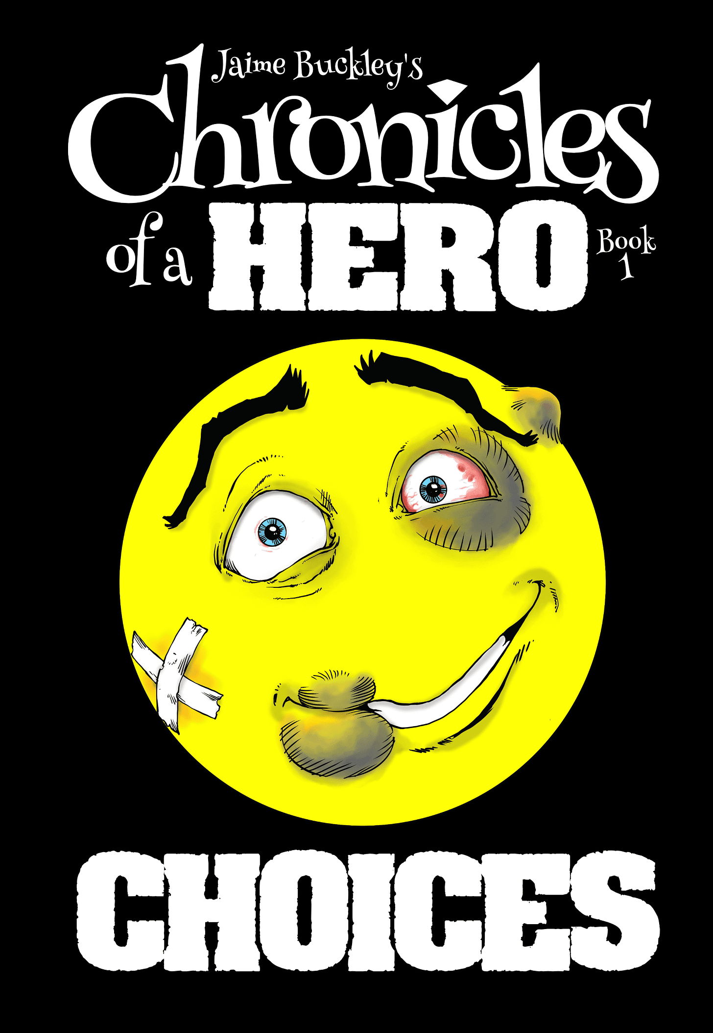

I’m a little late, and I love the updated version, although I did notice that you completely got rid of the gem on the “i”. Do you have plans to reincorporate the gem somewhere else? If not I feel like you might want to reconsider.
We have already talked about the benefits of having the gem on there, so I’m not going to rehash them.
Other than that, I really like the new cover, and I do think using the old fonts is an improvement even though I didn’t realize it needed to be improved. That’s my feedback for you, hope it helps
Yeah, I don’t know what to say, but if this cover makes you uncomfortable, change it back to what looks right to you. Be you! It’s what you do best!