Calling All Readers: Cover Ideas for Chronicles of a Hero...
It's like window shopping,...without any...windows....?
I’ve collected some cover ideas I’d like you to look over and comment on.
I’m sketching out some ideas for the cover…but in the meantime, I rounded up some covers that had aspects I liked.
None of them sang to me.
None of them work by themselves.
…and I keep wondering about the original comic books…being black and white.
I can draw much better today than I did back in my comic book days, and I would create amazing detail in a black and white cover…but would that work?
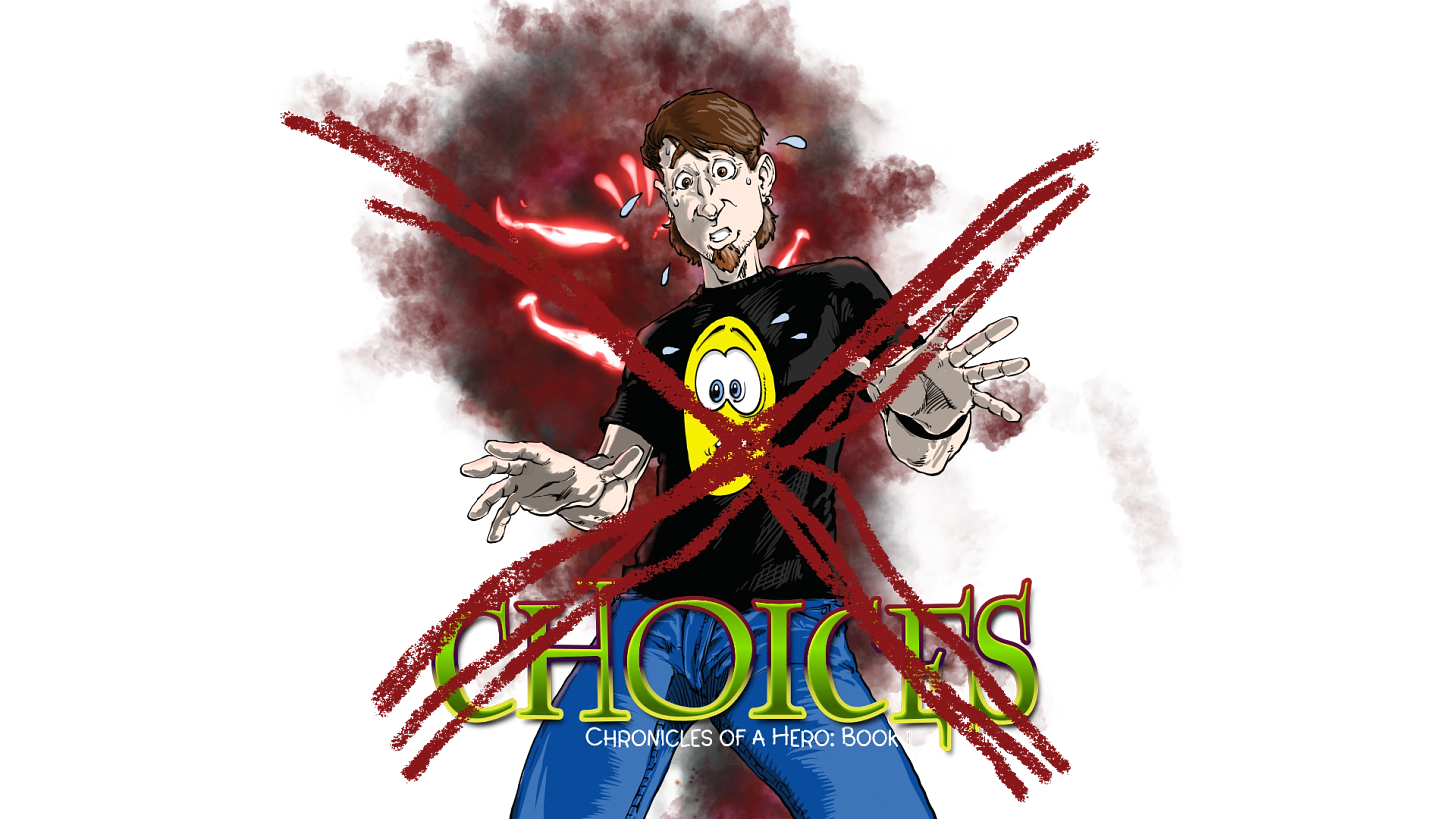
Honestly, I see the title being in color, and amazing detail with black and white ink drawings, and the only color on the cover art itself would be the yellow smiley on Wendell’s shirt.
That’s my underlaying thought at this point.
Here are some covers I grabbed that had decent features to consider. Let me know what you think. I’m interested in knowing what makes you excited.
Some of these I like the play with titles, the use of fonts.
Then something else hit me — and it went back, again, to black and white — and that’s doing a collective piece of art on the back spine of the books.
There is so much to play with here, and I’ve had some people I know push this part of the process aside. I’ve been urged to look at what other trends in books are showing, and go that route…and that’s the exact OPPOSITE of what I want to do.
This isn’t about me being crazy or rebellious.
It’s about making this series my own, and not do what I did last time…because no one got it. As much as David Farland begged me to not change the covers, as much as I would want to, “Don’t do it,” he said. “In the end, you’ll have THE most iconic covers in publishing, because anyone in the world, regardless of their language, regardless of if they are city dwellers or natives in the deepest area of the Amazon Forest knows what a smiley face is.”
Funny…but the more I stare at these covers, the more I wonder if Farland was right?
The books always sold well when people knew about them.
Unlike other books, you can see my cover clearly from across the entire library.
The smileys always show Wendell’s emotional state.
The smiley is the key logo of the series, and if you haven’t noticed, Life of Fiction also.
Huh.
Now I’m wondering.
…should I redraw the smiley covers???
Oh! OHHH!!
WHAT ABOUT THIS....
Imagine the front cover the same as the old ones, but far more details on the face.
Then as you turn the book, there is a frame with a spine picture, then on the back of shows a short black shirt sleeve and Wendells arm.
... but behind him would be a scene from the book, AND out could be black and white OR color!
First, I love the idea of the spines of the books coming together to create an image. That is something that I have always enjoyed in books that I have read. Second, I think going back to the smileys is a great idea, but I wonder if you could add a little? Like maybe have the smiley hanging in the background (like a massive sun setting) then put a few key aspects of the book in the foreground? I don’t know how that would turn out in the end, but it seems like it might work to me. There’s my feedback, hopefully it gives some more ideas and keeps those brain juices flowing