Calling All Readers: Cover Idea Revealed! [UPDATED]
We are 99% there...
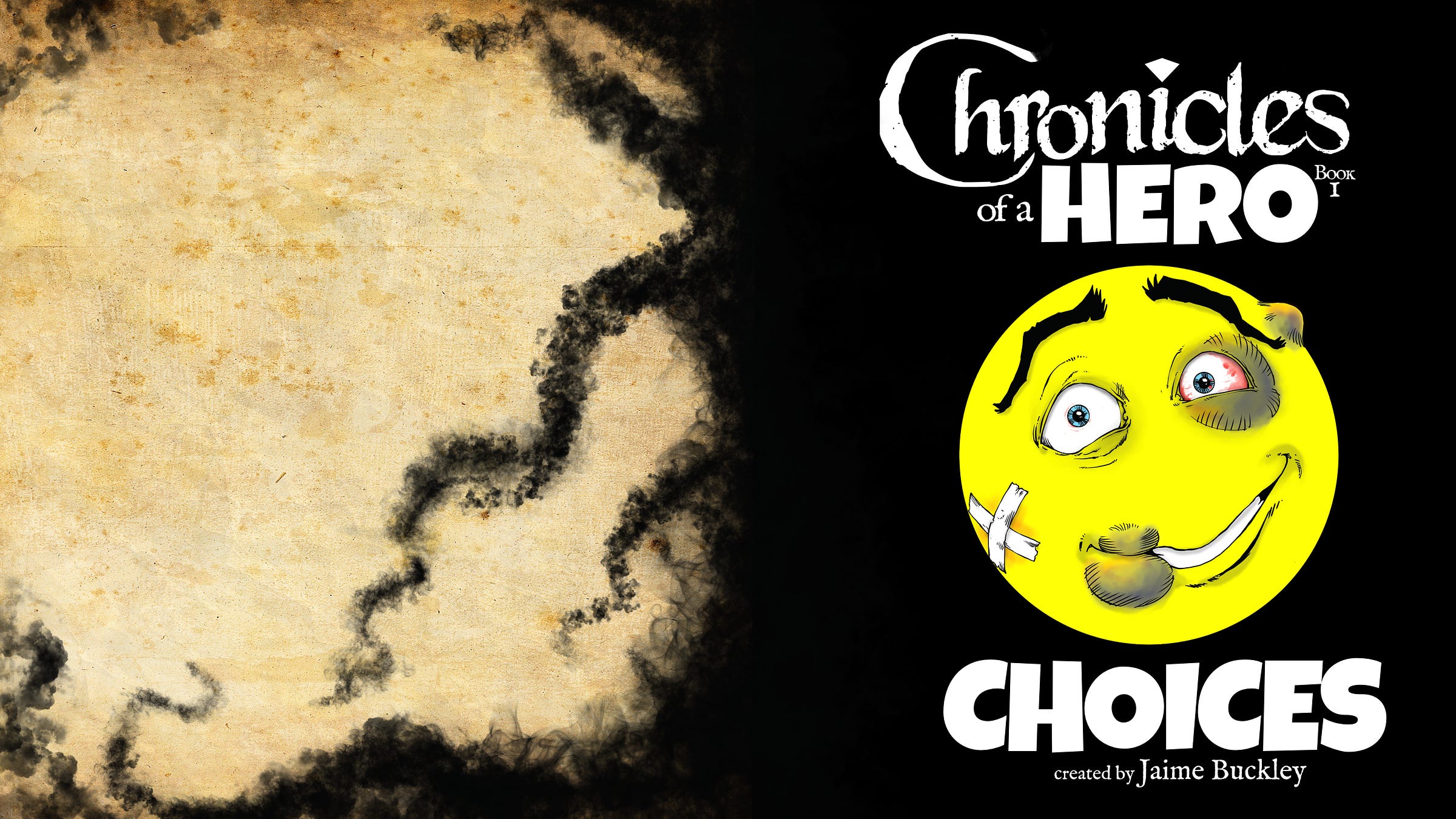
Cover Breakdown: Chronicles of a Hero – Book I: Choices
[UPDATED Saturday, OCT 26th]
Hello, my kindred!!
That’s one of my new favorite words from
from our community, which describes my connection with you awesomesauce guys and gaslsWe're taking the next step toward finalizing the cover for Choices, the first book in the Chronicles of a Hero series. I’M SO EXCITED!! I was hoping to be done by now and have the book published, but I am determined to do this right =)
I’ve received amazing feedback so far. Thank you for that. I could not do this without each of you…and I know some have wondered if they did any good…and the answer is YES!
Even if you’re unsure, but you have a feeling or impulse, your comments have made a huge difference in helping me. Sometimes we don’t know what we want, until we find out what we DON’T want…and that has been the case with this cover design.
We’re SO close to the final design. Today, I want to take you through the cover idea, section by section, showing you what I’ve been talking about. I’d like to explain the choices I've made and asking for your feedback.
Your input will help shape this cover into something we’re all proud of!
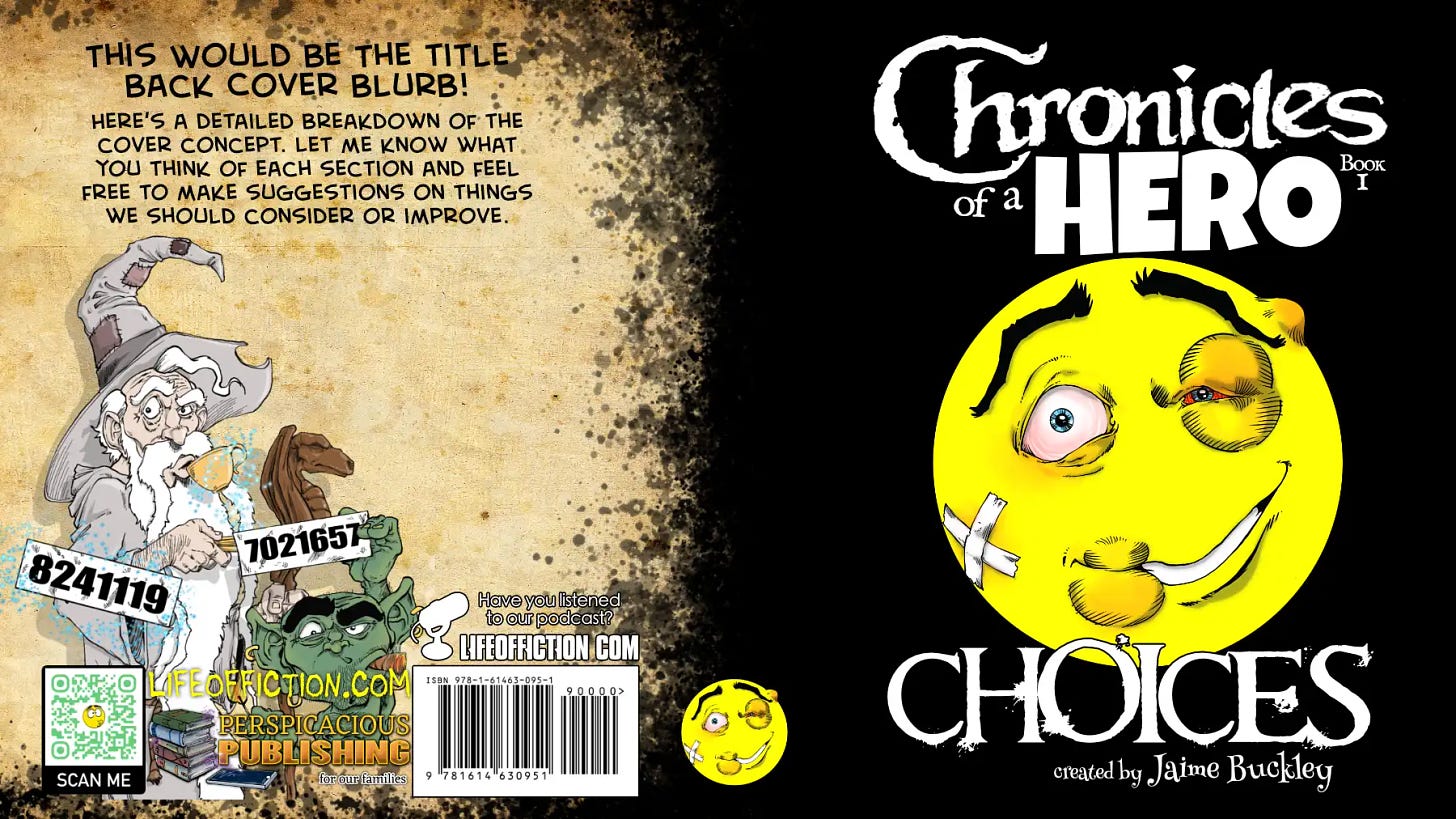
Here’s a detailed breakdown of the cover concept. Let me know what you think of each section and feel free to make suggestions on things we should consider or improve.
1. Title and Typography
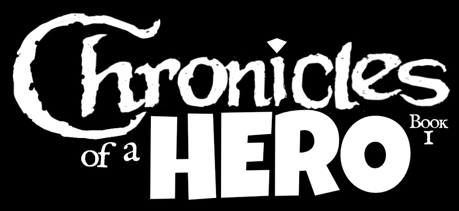
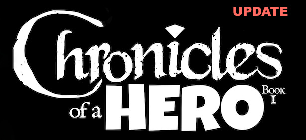
Feature: The title, Chronicles of a Hero, is designed with a bold, distressed font. The most prominent word is "Hero," done in blocky, eye-catching letters, while the rest of the title has a handwritten style, suggesting an epic, yet adventurous tone. The font for ‘Hero’ was chosen to mimc the personality of Wendell.
Notable Detail: Pay attention to the dot over the ‘i’ in "Hero." It’s shaped like a gem, symbolizing the Gem of Wendell P. Dipmier, our hero, and an essential part of the story.
Feedback Request: What do you think about the overall font choice and the gem detail?
Things to Consider: Should the gem be more prominent, perhaps glowing or emphasized with a different color? Does the font reflect the tone of the book well—heroic, but with a humorous twist?
2. The Smiley Face: Quirky, But Bruised
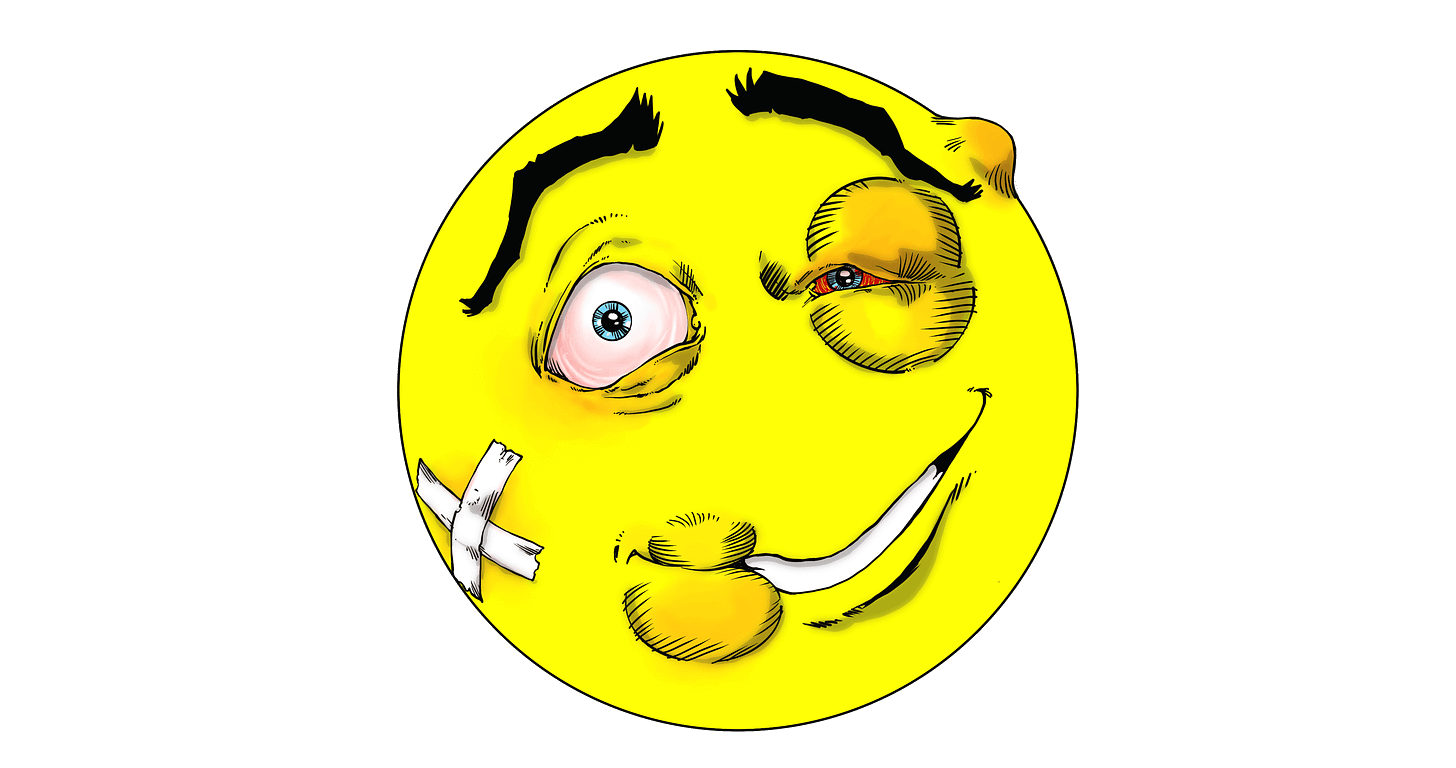
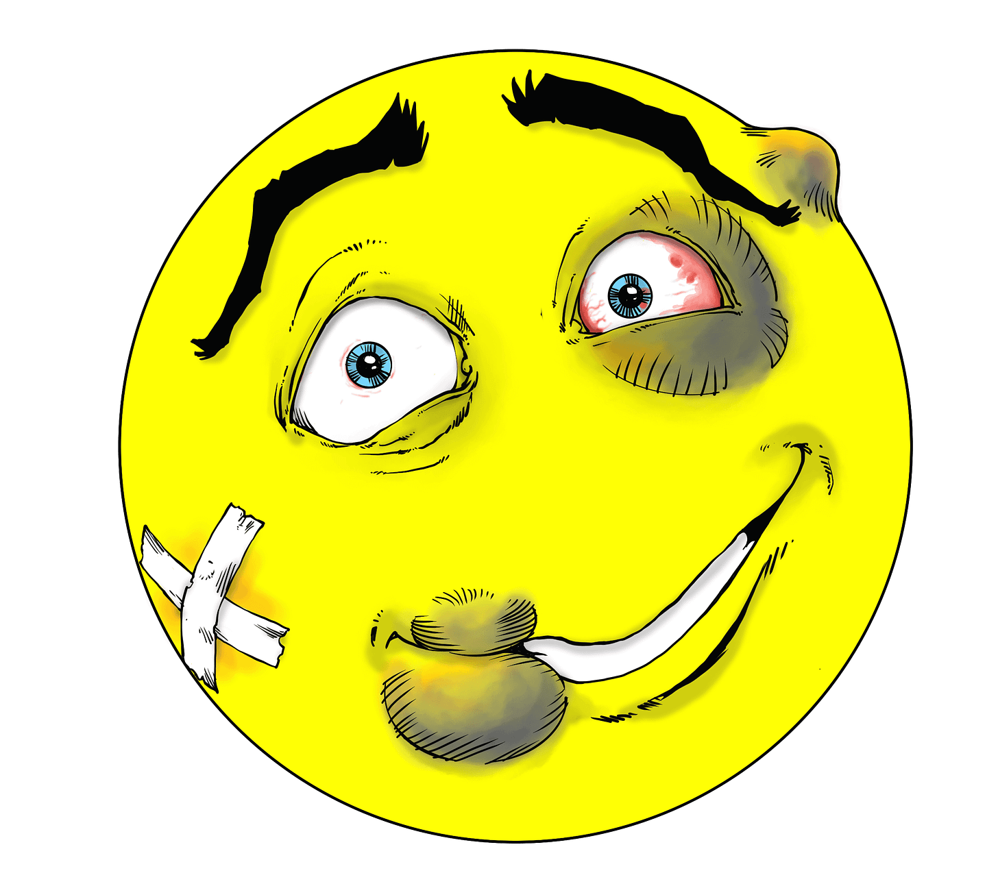
Feature: The central visual is a large, yellow smiley face with a beaten and bruised expression. It’s clearly meant to be fun, yet conveys that Wendell doesn’t have it easy as a hero. This smiley is a nod to the lighter, comedic elements of the series. As suggested, the smiley is…smiling.
Feedback Request: Does the smiley face capture the right balance of humor and heroism?
Things to Consider: Is the expression too exaggerated, or just right to reflect Wendell’s struggles? Should we play with different emotions on the face (such as determination, confusion, etc.)? Does the yellow pop out enough against the dark background?
3. The Black Background and Smoke Effect
Feature: The right side of the cover is predominantly black to create contrast with the smiley face and title. The black will flow seamlessly into the back cover, with smoke drifting in to symbolize the dark influence of Mahan, the villain of the story.
Feedback Request: How do you feel about the black-to-smoke transition?
Things to Consider: Should the smoke effect be more prominent or subtle? Does this give enough of a visual hint about Mahan's creeping influence over the story without overwhelming the cover? Would you prefer another color or texture on the back?
4. Color Contrast: Yellow vs. Black
Feature: The high contrast between the bright yellow of the smiley face and the deep black background gives the cover an energetic and dynamic look. It draws the eye immediately to the central character.
Feedback Request: Does the color scheme work for you, or is it too stark?
Things to Consider: Should we soften the colors or add more elements to break up the black? Are there other colors that could add depth or contrast without distracting from the central image?
5. Texture and Background Details
Feature: On the left side, the cover uses a parchment-like texture with ink splatters, gradually blending into the darker tones of the right side. This adds depth and gives the cover a worn, almost ancient feel, as if the story is coming out of the past.
Feedback Request: Do you like the textured background on the left side?
Things to Consider: Should the texture be more subtle or more pronounced? Does it create enough contrast with the right side, or would you prefer a more unified look across the whole cover?
6. Placement of Publisher Information
Feature: At the bottom left, we’ve added key publishing details, including a QR code, the website (lifeoffiction.com), and a small promo for the Perspicacious Publishing podcast. The back cover will also include the ISBN and additional information.
Feedback Request: Does the placement of the publisher details and barcode feel clean and unobtrusive?
Things to Consider: Are the QR code and promotional details appropriately placed, or would you suggest an alternate arrangement? Is there too much or too little text at the bottom?
Final Thoughts and Your Input!
As we move toward completing this cover, I want to hear your thoughts. Please share any suggestions or adjustments you think would make the design even better. Here’s a quick recap of the points where I’m specifically seeking feedback:
Font & Title Design: Is the gem over the ‘i’ too subtle? Does the font match the tone?
Smiley Face: Should we experiment with different emotions or stick with the current expression?
Black & Smoke Transition: Does the smoke effect create the right level of visual interest?
Color Contrast: Is the yellow and black contrast too stark, or does it work well?
Texture & Background: Should the texture be more or less prominent?
Publisher Info Placement: Is the placement of the QR code, ISBN, and promo elements clean and functional?
Thanks so much for all your feedback.
Communicating with you is always the high point of my week…just so you know.
Each step brings us closer to a finished product that reflects the spirit of Chronicles of a Hero and, of course, your valued input!




Sorry, Jamie, I meant to try to answer this sooner, so I hope I’m not too late.
I see there are updates to the art on the cover… But I’ll post here what I answered about the first version, first. Likely won’t make a difference.
1. Love all the fonts! Notable detail: I was wondering if the gem couldn’t be blue like your logo?
2. I think your concept for the beaten and bruised :-) is PERFECT, but I had to think about it in thumbnail size and from across the room, when you can’t see it clearly… What would that look like? And I wondered if the specific swollen lip shape could not quite so closely matched the shape of the swollen eye… Because somehow it gave me the impression of the face being attacked by some sort of bug because the two looks so similar. Adore the idea and everything about it! That’s my only comment.
3. Although I have to admit, I made no connection to smoke, I also adored the look of the back cover, bleed into the black… Which to me in thumbnail size looked like the worn edges of a page… But I LOVED it! So what’s wrong with that? Wouldn’t change a thing. (I see some trailing smoke tails in an update? I loved the first way, but you’ll make everything look good so…)
4. Colour contrast is great to my mind! (And I already know from my incoming covers that artwork shows up different shades and vibrancy on each different screen and computer. So you’ll have a much better idea than I could!) I had imagined it might be too stark when you first mentioned it… But I don’t think so now with the touches of red, yellow and orange in the wounds. I think it works exactly as you wanted it too! Afterthought: maybe the Band-Aid could be a smidge bigger to be seen across the room. That really helps.
5. Love the texture! I think it brings everything together and makes it look super professional! (And hate that word by the way, but just saying! ;-))
6. Overall, the publisher info looks and works great! I think the Life of Fiction in the middle feels maybe a little too bit close to the QR code square? But I especially noticed the promo of the podcast and ADORE it. More lines or shading on the mic? Don’t care. Pretty perfect! 👍 🤩🏋️🤗👏👏👏❤️✨👋
Kindreds, baby!! 🥰 They clearly have the solid gold feedback for you here. This HERE is why I swear by co-creating with my kindreds.
I'm soooooo excited for YOU, that this is almost ready to come out. You know the vision... take your time, it's just building anticipation.